If you click on a link and make a purchase we may receive a small commission. Read our editorial policy.
EC Comics is returning after 68 years - and so is its iconic lettering font & style, with a 21st century upgrade
A classic EC Comics hallmark returns - but not just for nostalgia


Popverse's top stories
- Justice Gang boss Maxwell Lord will appear in another DC Studios project soon, says Sean Gunn - but he can’t say which one
- The Marvel art that made Jim Lee a superstar is being collected in one massive book
- Magic: The Gathering is giving Liliana Vess the main-character treatment
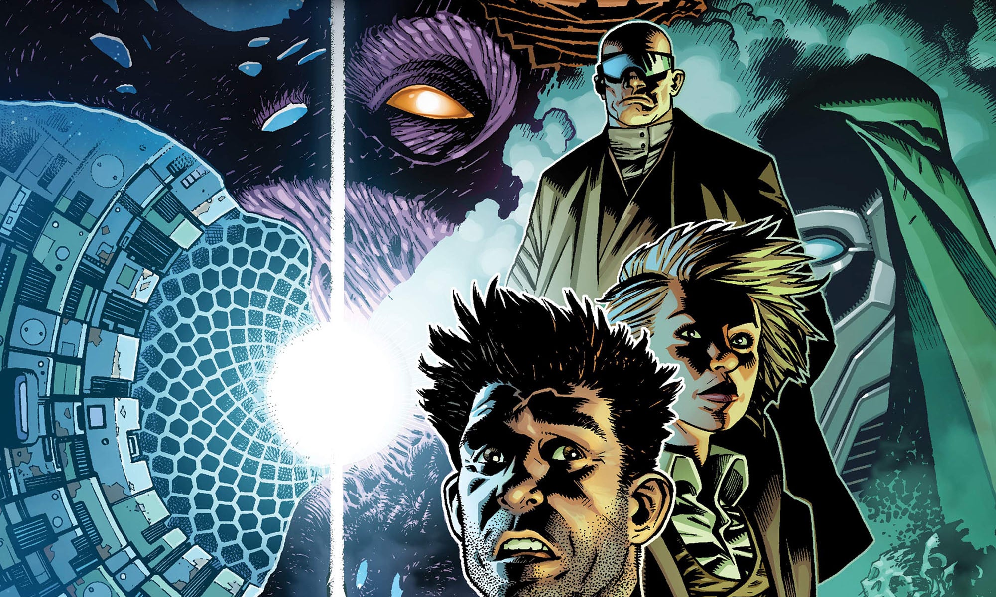
Comics is the perfect synthesis of words and art. And while the words are sometimes merely to communicate the the story, when done right how the words are written, drawn, or set can communicate just as much. A shining example of that is the iconic lettering found in the classically lurid and scintillating horror stories of EC Comics.
One of the quintessential parts of the original EC Comics experience, whether you bought the issues as they came out or you read them subsequently in tattered back issues or collections, is its lettering. The style is anachronistic and symbolic of a bygone age - but that's entirely it's charm. And as Oni Press prepares to revive the 60+ year old horror brand for a new line of comics, they are aiming to get all the details right - even down to the font.
"We’re taking great pains to bring the power and intensity of EC’s genius-level storytelling conventions into 2024 without making them an exercise in nostalgia or slavishly reverential to how things might have been done in decades past," says Oni's president/publisher Hunter Gorinson. "That being said, there was one classic EC detail that we knew needed to be preserved: The original Leroy lettering style, which still make EC’s stories – even when reduced down to a single panel – immediately recognizable at a distance."

This Leroy lettering style is named after a mechanical lettering device called a Leroy pantograph - which came out in the early '50s as a way to have exact lettering on drawings, before the wide adoption of typewriters and other typesetting devices. Then-EC Comics publisher Will Gaines actually hired a former Leroy salesman and his wife, Jim and Margaret Wroten, to letter the entire line of EC Comics using this method.

While the Leroy pantographs haven't been made for decades, they are available on the second-hand market - but is an intensely time-consuming endeavor. After some fan attempts at replicating the EC Comics 'Leroy' font, Oni Press has hired arguably comics' most prolific modern letterer (and font designer) Richard Starkings to resurrect the style and adapt it for modern-use in the upcoming EC COmics revival.
"Knowing that we have a legendary talent of Richard Starkings’ caliber overseeing this vitally important aspect of the creative process behind Epitaphs From the Abyss and Cruel Universe is both an honor and a true joy," adds Gorinson.
The font will make its formal return with Oni's first EC Comics release, Epitaphs from the Abyss #1 (of 5), due out July 24.
Get ready for what's next with our list to upcoming comics and how to buy comics at a comic shop.
Follow Popverse for upcoming event coverage and news
Find out how we conduct our review by reading our review policy
Let Popverse be your tour guide through the wilderness of pop culture
Sign in and let us help you find your new favorite thing.


Comments
Want to join the discussion? Please activate your account first.
Visit Reedpop ID if you need to resend the confirmation email.