If you click on a link and make a purchase we may receive a small commission. Read our editorial policy.
Superhero logos: Examining DC and Marvel's very different approach towards branding
Distinguishing between different hero and villain brand designs at Marvel and DC


I love logos. I love superheroes. That gives you an accurate assessment of where my mind wanders during the day. Since I was a kid obsessed with superheroes, their logos, costumes, and moral alignments since I was a kid. In my current mature state (says the man waiting for his son's motor skills to solidify so we can play with action figures together), I realized I was always inadvertently paying attention to how these characters were branded.
Evil variants of your favorite heroes donning darker or straight black versions of their outfits or reimagined characters that tend to fall flat for lack of character brand consistency (here's looking at you, electric Superman). I couldn't articulate as a child why some things resonated while others bombed in my mind. Now, armed with my extensive design knowledge, it all makes sense. Superhero brands are globally recognized and timeless based on their iconic logos or popular aesthetics, from colors to icons.
I was a DC kid growing up, primarily due to my mother gifting me a large set of DC Comics trading cards as a boy. The pantheon of DC Comics heroes is what we fans would consider 'classic' superheroes. Their elaborate costumes, vibrant colors, zero moral ambiguity, and bold logos are emblazoned on their chests. In contrast, their competitors at Marvel, who could be considered more grounded characters, lean more into aesthetics than hero identity. Let's explore the brands of these heroes, see how they differ, and how those differences ultimately shape our perception of them.
What makes an effective superhero logo?
Before we sup of the superhero cup, let's take a short detour into what makes a logo successful. In short, a logo is meant to identify. It's the fastest way to recognize a brand. If you drive down the road and see a giant white billboard with a bitten Granny Smith on it, you know Apple is trying to sell you something. According to Sagi Haviv, partner at Chermayeff & Geismar & Haviv, there are three rules to good logo design. It must be Appropriate, Distinctive, and Simple. They must work small, in black and white, and should only say enough to make an immediate association with a brand.
Logos shouldn't try to say a whole lot. That is what the rest of the brand (messaging, color, type, vision, etc.) is for. When discussing superhero branding, I also like to add that the character's logo should be so simple that a child could draw it. With two lines and a circle in the middle, DC crafted a brand representing the most potent force in the universe, the Green Lantern's, while an unassuming 'X' is synonymous with Marvel's mighty mutants.
When applying this philosophy to superheroes, you can start to understand why you are or aren't drawn to certain characters. I have been told that logos don't matter, and it's the content and experience that are key to success. If your brand has a good range and your fans enjoy their time with it, what difference does a 'good' logo make? I am not a confrontational person. You are allowed to believe this. You are categorically wrong, but you are allowed to be. Confrontation aside, these contrasting thoughts represent DC and Marvel characters, respectively.
Logo-Focused characters of DC Comics

"Unusual enough to persist in our mind" is a quote from Mr. Haviv when describing a distinctive logo. If I were to tell a random someone to draw Superman's symbol, there is a high probability that they would scribble that icon shield reasonably quickly regardless of their fandom level. It's a bold (Appropriate), unique (Distinctive), shape (Simple) that over the years has become synonymous with not only Superman but the idea of Superheroes in general. If you scan the internet, most of the generic superhero clip art uses the Superman shield shape as a placeholder. Now go down the Justice League roster.
The amount of timeless, iconic logos in their ranks is a sight to behold. The Flash's lightning bolt, John Stewart's lantern, the stacked W's of Wonder Woman, and Batman's iconic bat. Each character's logo is supported by the hero's branding. The color palette, the costume, and their moral code. It all feeds into who the character is. Coupled with these other brand elements, the logo becomes a shorthand for the hero and who they are as a character. Slap a Superman shield on your chest, and I bet you will, at some point, put your hands to your hips in his iconic hero post, while a Batman logo will make you brood (especially after Robert Pattison's take in The Batman).
Aesthetic-based characters of Marvel

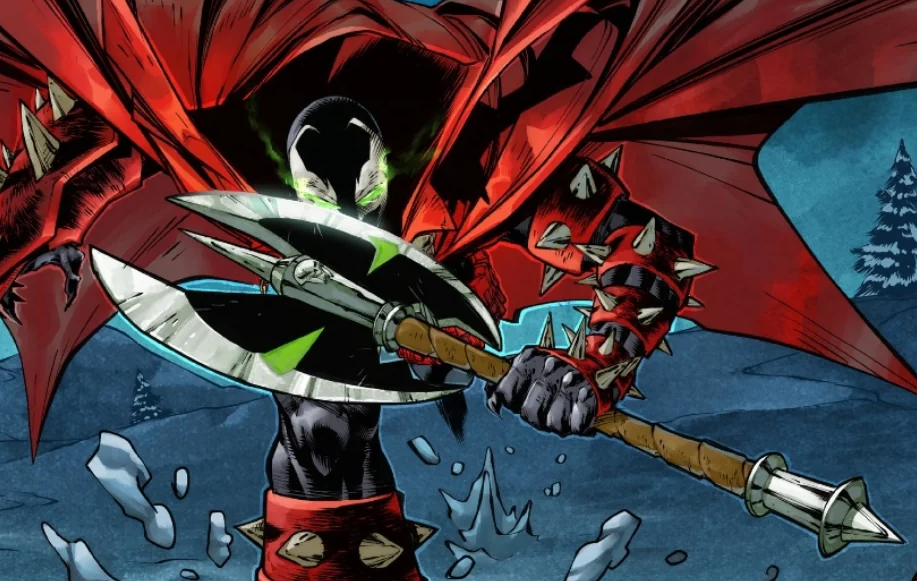
What is Iron Man's logo? Is it the arc reactor? The helmet? What about Dr. Strange? How about Wolverine? Ghost Rider? Dum Dum Dugan? I can go on. A good majority of Marvel's most popular heroes don't ascribe to logos but lean heavily into other aspects of their branding. Their costumes do a lot of the heavy lifting. A spider on a t-shirt could be any number of Spider-Heroes, Venom, or some generic knock-off you buy at a gift shop in Times Square, New York. You need the iconic webbing and the red and blue color scheme to be branded as classic Peter Parker Spider-Man.
Many Marvel characters rely on their unique silhouette and distinct color combos to identify them. If you paint Thor all black, he (or she) is still identifiable by the winged helmet, hammer, and stature. The same goes for Wolverine, Galactus, Ghost Rider, etc. The ink over the smooth contours of Superman and he could be mistaken for any other generic caped hero.
Contrary to popular belief…
These are not hard-and-fast rules for each company by any means. Many DC Comics characters like Wildcat or Vixen lack a defining symbol. On the opposite side, groups like the Fantastic Four or the X-Men are keen to slap their iconic logo on any and everything they touch. There are more logo-clad heroes and villains in DC Comics than Marvel, mostly going back to their character focus, classic vs. grounded. Iron Man and Hulk aren't worried about their logos. They have their own human problems to deal with. In DC, the heroes are gods. Symbols of hope to inspire the masses. They emblaze logos on their chest in bright colors to draw a villain's attention away from us puny mortals.
Logos live rent-free in the mind and resonate when you aren't even thinking about them. If you are a fan of Reed, Sue, Johnny, and Ben, and while out on a daily stroll, you see a random 4 inside of a circle, you will think of the Fantastic Four. A logo helps define how easily communicable each character is on a much broader scale. I can communicate the Green Lantern to you faster with a badge than I can sketch someone like Storm.
Relying on aesthetics is more involved but compelling nonetheless. A huge key to successful comic book characters is their silhouette. A silhouette of the Justice League is probably harder to discern than one of the Nightstalkers. You can point out the Ninja Turtles in a heartbeat, and Wolverine and Spider-Man have some of the most famous silhouettes in fandom. Maybe not the fastest to get across on the spot, but certainly easily recognizable when done correctly.
What does it all mean?
This is an excellent way to help shape how you perceive and explain certain superheroes and villains. The next time you see a superhero logo, go down the checklist and see if it's Appropriate, Distinctive, and Simple. On the other hand, if you run across a hero or villain not sporting a nifty brand logo, check how unique or striking their silhouette is against other characters on the page or screen. Look inwards and analyze the characters you've come to love and see which category they fall into. If they don't, ask yourself what makes them memorable and how would you communicate that aspect to someone to help them guess the character. Let me know what you come up with in the comments.
Follow Popverse for upcoming event coverage and news
Find out how we conduct our review by reading our review policy
Let Popverse be your tour guide through the wilderness of pop culture
Sign in and let us help you find your new favorite thing.


Comments
Want to join the discussion? Please activate your account first.
Visit Reedpop ID if you need to resend the confirmation email.