If you click on a link and make a purchase we may receive a small commission. Read our editorial policy.

All's well that's Rockwell: Mitch Gerads on the weight of midcentury influences at Fan Expo San Francisco

"It's all about trying to get that Norman Rockwell vibe that probably isn't real, but the ad artists made it look real."

Mitch Gerads
Image credit: Popverse

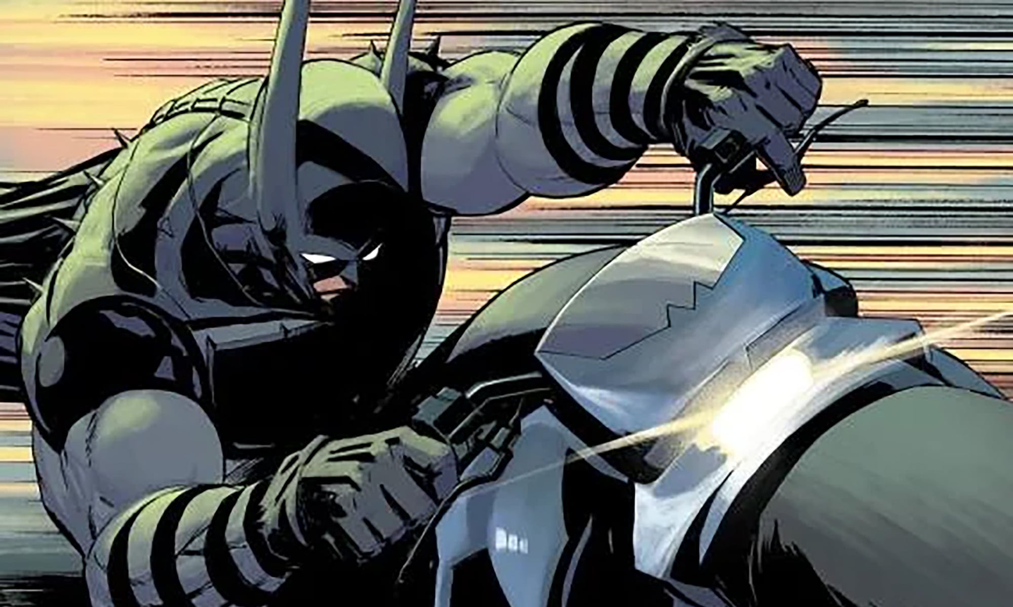
Not to shake things up by sharing comics gossip, but if you’ve spent more than two seconds on the comics internet or within DC comics circles over the last decade, there’s a good chance you might have heard of this guy named Mitch Gerads. With an art style that took the scene by storm combining mid-century style and a dynamic new kind of digital feel, it’s an easy sell that Gerads is one of the most unique of the comics mainstream in the contemporary age. But where does that come from? And for that matter, where does the spark of ingenuity stem from when an artist is harking on halcyon days of art marketing past?

Popverse was fortunate to sit down with Gerads at his table at Fan Expo San Francisco to discuss how the mainstream can come to accept such a bygone era of art, and how harnessing the propaganda of mid-century advertising doesn’t always have to make for propaganda itself.


Popverse: Mitch, before we get started on anything else, talk to me a little bit about your process. Because I have heard that you do something kind of interesting with gray scaling when it comes to your coloring.

What I do is I have a very odd process where I do quick tiny thumbnails next to the script about that big, and then I kind of collage reference and drawing and all these things in Photoshop and make that a blue line. Then I do all my drawing in the ink stage. It's all digital. When I get to that final part of actual drawing, I'll do a lot of analog texture and scan it in, add it digitally. But then I've started adding all the gray tones during the line. And it just makes coloring go so much faster because all the value is already there. So coloring is kind of just flat coloring, but it looks more voluminous because I've done all the work already.

I've never heard of anybody doing any coloring like that.

Another thing I found is that I rarely ever keep my line art completely grayscale. What I'll do is when I'm coloring it – especially on things like Strange Adventures, which is set a lot more during the day – if I kind of turned my line art a little orange, it just made everything round out and more human like.

It’s kind of amazing how digital stuff like this really is sort of reinventing the wheel, isn’t it?

And what's funny is all the little techniques I use currently, every single one of them is found completely by accident. It's all just me monkeying around and then being like, oh, there we go.

How about then you tell me a little bit about your relationship with mid-century art and

Subscribe to Popverse to read this article

Become a member and get first access to tickets and badges to our events, photo ops, exclusive content, and more.

Chloe Maveal

Chloe Maveal: Chloe Maveal is the Editor-In-Chief of the guerilla website The Gutter Review, and is a freelance essayist who specializes in British comics, pop culture history, and the subversive qualities of “trashy” media. Their work has been featured all over the internet with bylines in 2000 AD, The Treasury of British Comics, Publishers Weekly, Polygon, Comics Beat, and many others.

Comments

Want to join the discussion? Please activate your account first.
Visit Reedpop ID if you need to resend the confirmation email.

View Comments (0)

Find out how we conduct our review by reading our review policy