If you click on a link and make a purchase we may receive a small commission. Read our editorial policy.
The 1990s Marvel superhero art style created to make Whilce Portacio’s X-Men more kid-friendly
In a conversation with Rob Liefeld, legendary X-men artist Whilce Portacio reveals the "fade" style of 1990s superhero comics came from his switching to more PG-13 Marvel Comics fare


Popverse's top stories
- Thor’s construction worker era is about to collide with a corporate monster in Mighty Thor #11
- MEMBERS ONLY: Popverse Playlist: The 3 things you need to check out in pop culture April 25 through May 1
- Mobile Suit Gundam fans have been missing the series' anti-war message for nearly 50 years
Four decades after his own art started appearing in comic books, Rob Liefeld is still just as big a comic art nerd as he was when he was a kid. Case in point - his recent chat with Whilce Portacio, whose X-Men run, the Deadpool creator admits, was a huge influence on his own work. In particular, Liefeld wanted to talk about a special technique he attributed to Portacio, although ironically, Portacio immediately attributed it to a Marvel Editorial decision. That is, the decision to make his art more kid-friendly.
The conversation happened on Rob Liefeld's YouTube channel, where the Robversations host told his guest Portacio, "I've made you the godfather of the fade. What I call the fade. Do you understand what I'm talking about when I call the fade?"
Of course, Whilce Portacio does know what Rob meant - but for those of us that don't, take a look at this excerpt from the artist's work on 1991's Uncanny X-Men #282:
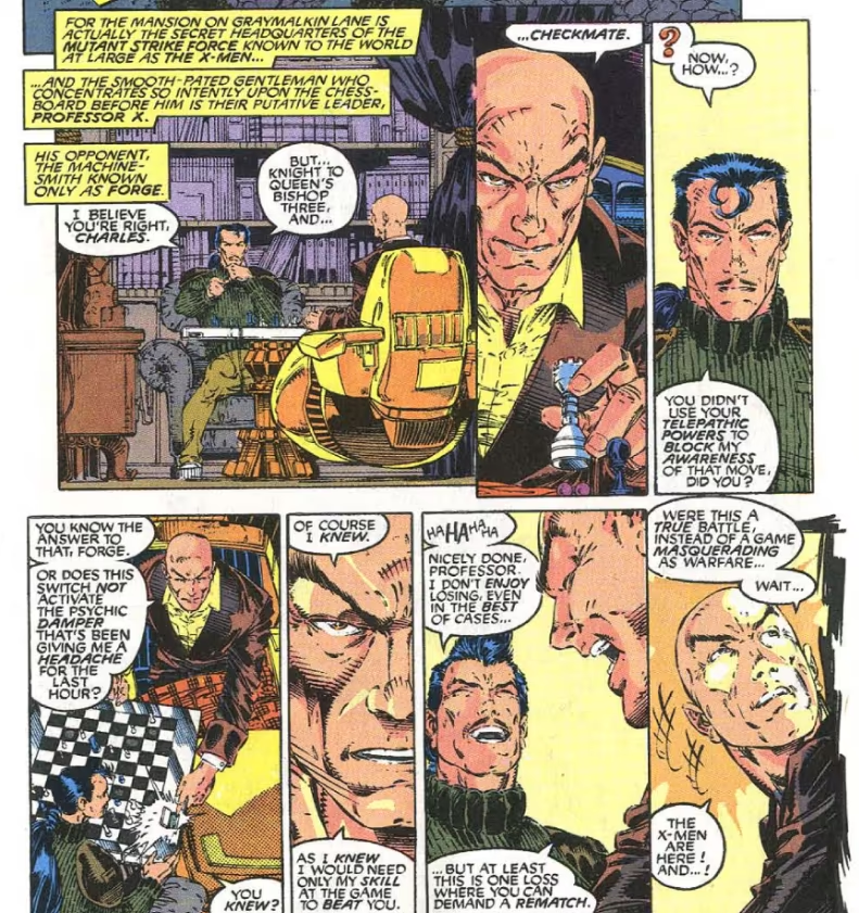
See how Portacio's shading in places like the underside of Professor X's chair or in between his shirt and chest doesn't fade entirely to black, but just uses coagulating lines to represent shadow? That's what Rob's so excited to talk about here - an artistic choice that would come to be one of the most familiar hallmarks of 1990s superhero comics.
"If you see these lines that start out in a tight formation horizontal and then they break up and then they come back together. Where did you come up with that? Because I saw it in Dale Keown's Hulk - I'm like, 'Oh, we're all looking at Whilce.' Okay. Where did you come up with that?"
"You know, you might be a little disappointed, okay? Because it was a demand from editorial. If you look at my Punisher stuff, I [shade with] black. Because it's a noir, you know, crime thing, right? So when I go to X-Men, [...] over a short period of time, [Marvel editorial] let me know that, 'Hey, it's mostly kids looking at this. So, can you add a droplight?' So that's what it is. It's not me going to black; it's me going, 'I'm [about] to be going to black here. Let me drop in another rim light or something.' And that became kind of the signature of the book."
It goes to show, comics reader, that art can be inspired by even the most mundane of things. Then again, few things can truly be considered mundane if they're coming out of Rob Liefeld's mouth.
To me, my X-Men fans. Want more about Marvel's mutants? You don't need Cerebro to find what you should read next... we made a list!
- The best X-Men comics
- Every Omega-Level X-Men mutant ranked by power
- How to read the Marvel Comics' X-Men in order following the Krakoa era
- Why the Krakoan Age of X-Men was ended by Marvel
- How to watch the X-Men movies in order
Follow Popverse for upcoming event coverage and news
Find out how we conduct our review by reading our review policy
Let Popverse be your tour guide through the wilderness of pop culture
Sign in and let us help you find your new favorite thing.


Comments
Want to join the discussion? Please activate your account first.
Visit Reedpop ID if you need to resend the confirmation email.